Tutorial: UI Zoo
You will need to build an modified version of UI zoo example from makepad. This tutorial will lead you get deep into makepad step by step.
You could find the code here. The code for each section in a separate git branch. This makes it possible to see the intermediate state after each section.
Set up your project
To build the Makepad crates you first need to install Rust. https://www.rust-lang.org/tools/install
We recommend that you build Makepad using the nightly Rust toolchain.
1rustup install nightly
2rustup default nightly
Use cargo new makepad_book_ui_zoo to create a crate.
1cargo new makepad_book_ui_zoo
Add the makepad-widgets library dependency in Cargo.toml. Makepad is using 2021 version right now, so please change edition = "2021".
1[package]
2name = "makepad_book_ui_zoo"
3version = "0.1.0"
4edition = "2021"
5
6[dependencies]
7# use dev branch,because it is the active development branch
8makepad-widgets = { git = "https://github.com/makepad/makepad", branch = "dev" }
Then create lib.rs and app.rs files under src.
Your directory structure should look like this:
1simple/
2├── Cargo.lock
3├── Cargo.toml
4├── src
5│   ├── app.rs
6│   ├── lib.rs
7│   └── main.rs
Create basic window
Then let's complete our code in the app.rs module.
Let's start by defining the overall component structure:
1use makepad_widgets::*; // Import Makepad Widgets package
2
3// Define live_design macro for declaring UI components and layout
4live_design! {
5    // import Makepad theme and shaders, and widgets
6    use link::theme::*;
7    use link::shaders::*;
8    use link::widgets::*;
9    App = {{App}} {
10        ui: <Window> { }
11        }
12    }
13
14
15// Define App struct containing UI and counter
16#[derive(Live, LiveHook)]
17pub struct App {
18    #[live]
19    ui: WidgetRef // UI component reference
20}
21
22// Implement LiveRegister trait for registering live design
23impl LiveRegister for App {
24    fn live_register(cx: &mut Cx) {
25        // Register Makepad Widgets' live design
26        makepad_widgets::live_design(cx);
27    }
28}
29
30// Implement AppMain trait for handling events
31impl AppMain for App {
32    fn handle_event(&mut self, cx: &mut Cx, event: &Event) {
33        // Handle UI events
34        self.ui.handle_event(cx, event, &mut Scope::empty());
35    }
36}
37
38// Define application entry point
39app_main!(App);
Add the following code to lib.rs:
Add the following code to call app_main() in main file:
1fn main() {
2    makepad_start::app::app_main();
3}
Run this project by
cargo run
You could see the output:
Let's explain the code structure, you don't need to understand them right now:
live_design!,The live_design! macro is used to declare UI components and layout. It's part of the Live system we discussed earlier, implementing Live DSL using Rust macros to enable runtime UI modifications.app_main!(App)defines the application entry point. Since Makepad needs to support cross-platform applications (including Web/iOS/Android/MacOS/Windows/Linux), the app_main! macro internally includes entry point code for various platforms, hence using a macro rather than a simple main function.- The Rust struct
App uses the derive(Live, LiveHook) derive macro, automatically implementing two Live system-related traits for App: Live and LiveHook.
- The
ui field of type WidgetRef can be thought of as dyn Widget, representing UI controls that implement the Widget trait. These controls can be updated at runtime, marked with the #[live] attribute, which automatically implements certain derive macros, like creating LiveId for the field and calling LiveHook methods.
- The
counter field belongs to business logic, used for counting, so it's marked with the #[rust] attribute, telling the Live system it belongs to Rust's domain rather than UI controls and doesn't participate in runtime updates.
- The
Live and LiveHook traits are related to Makepad controls' Live lifecycle, which we'll discuss in detail later.
- The
LiveRegister trait is used to register App with the Live system.
- The
AppMain trait defines the handle_event method for passing various events to the UI tree, including mouse, timer, or scroll events.
- This trait object is actually called in
app_main!, making it part of the program entry point.
- Internally,
ui's handle_event takes parameters cx/event for context information and events, while Scope is used for component state sharing, with Scope::empty() currently representing no shared state.
Change background color and title
We can change the background color to the window by simply define color inside draw_bg field.
Background Color
There are several way to present color. For color using vec3(), the range is 0 and 1 instead of 0 to 255. For example, you can convert the color #970707 to vec3 form. #970707 is a dark red, and its RGB values are (151, 7, 7). By converting these values to floating-point numbers between 0 and 1, you can get vec3(0.592, 0.027, 0.027).
1live_design! {
2    // import Makepad theme and shaders, and widgets
3    use link::theme::*;
4    use link::shaders::*;
5    use link::widgets::*;
6    App = {{App}} {
7        ui: <Window> {
8            show_bg: true,
9            draw_bg: {
10                color: #970707    // dark red
11                // color: vec3(0.592, 0.027, 0.027) // dark red as above
12                // color: vec3(1, 1, 0) // yellow
13                // color: #000 // black
14                }
15...
16        }
17    }
18}
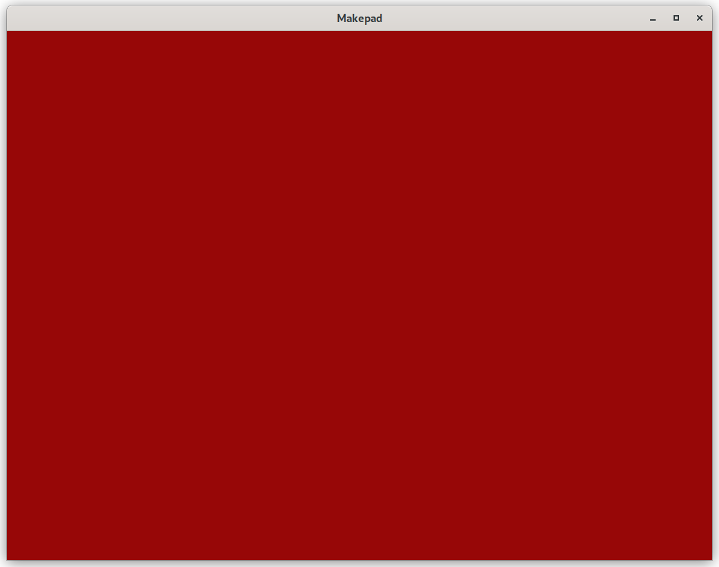
Try to change whatever color you want by yourself!
And the code is available.
Title
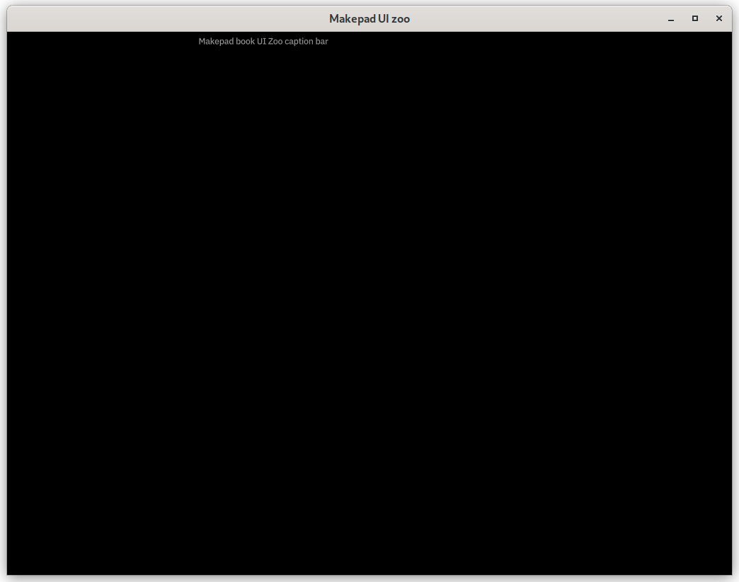
The window section sets the window's title to "Makepad UI zoo".
Following that is the caption_bar section, which defines a caption bar. visible: true indicates that the caption bar is visible, and margin: {left: -500} sets the left margin of the caption bar. You can change the value to move the position of the caption bar label.
Finally, caption_label defines the label within the caption bar, with its text content set to "Makepad book UI Zoo caption bar".
1ui: <Window> {
2            show_bg: true,
3            draw_bg: {
4                // color: #970707    // dark red
5                // color: vec3(0.592, 0.027, 0.027) // dark red as above
6                // color: vec3(1, 1, 0) // yellow
7                color: #000 // black
8                }
9            window: {
10                title: "Makepad UI zoo"
11            },
12            caption_bar = {
13                visible: true,
14                margin: {left: -500},
15                caption_label = { label = {text: "Makepad book UI Zoo caption bar"} },
16            },
17        }
 And the code is available.
Text
From this section, we swtich the background color back to default for better display effect. Simply comment all the color field in draw_bg
1draw_bg: {
2                // color: #970707    // dark red
3                // color: vec3(0.592, 0.027, 0.027) // dark red as above
4                // color: vec3(1, 1, 0) // yellow
5                // color: #000 // black
6                }
Let's try to write some text inside this application~ But first, we need to define a child component body inside window:
1caption_bar = {
2                visible: true,
3                margin: {left: -500},
4                caption_label = { label = {text: "Makepad book UI Zoo caption bar"} },
5            },
6
7            body = <View> {
8                width: Fill, height: Fill,
9                flow: Down, //child components will be arranged vertically
10                spacing: 10.,   //spacing between child components
11                margin: 0.,     //margin around the component
12            }
This View component which provided by makepad will be called body in our appliation. It takes up the full width and height of its parent container. It arranges its child components vertically, with a spacing of 10 units between them. The margin: 0. property ensures that there is no extra space around the body component itself.
Then the text itself can also be declared above of ui
1ZooTitle = <View> { // Define ZooTitle component inheriting from View
2        width: Fill,    // Fill width
3        height: Fit,    // Fit height
4        margin: 10.0,
5        title = <H2> {
6            text: "Makepad UI Zoo"
7        }
8    }
9    ...
10    App = {{App}} {
11        ...
Then we can set the text component independently above ui:
1live_design! {
2    // import Makepad theme and shaders, and widgets
3    use link::theme::*;
4    use link::shaders::*;
5    use link::widgets::*;
6
7    ZooTitle = <View> { // Define ZooTitle component inheriting from View
8        width: Fill,    // Fill width
9        height: Fit,    // Fit height
10        margin: 10.0,
11        title = <H2> {
12            text: "Makepad UI Zoo"
13        }
14    }
15    ...
Remind from previous sections, width: Fill means it will fill the parent component's width, height: Fit will set component height depends on its height. H2 component using markdown grammar to set the size of the text.
Then combine it together:
1body = <View> {
2                width: Fill, height: Fill,
3                flow: Down, //child components will be arranged vertically
4                spacing: 10.,   //spacing between child components
5                margin: 0.,     //margin around the component
6
7                <ZooTitle> {}
A title and description is needed for every group of components, let's define them now and reuse them in the future.
1ZooHeader = <View> {
2        width: Fill, height: Fit,
3        flow: Down,
4        spacing: 10.,
5        margin: {top: 0., right: 9, bottom: 0., left: 9}
6        divider = <Hr> { }
7        title = <H3> { }
8    }
9
10    ZooDesc = <P> { }
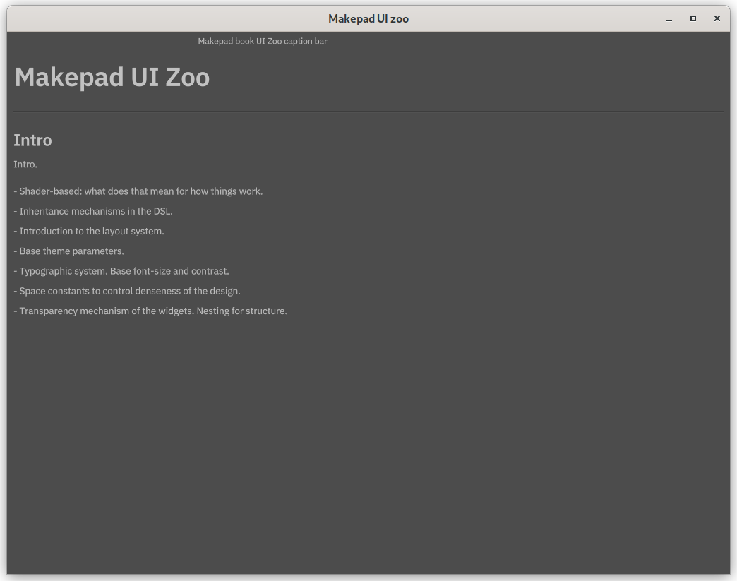
You will see some familiar thing in HTML, and it works just like that! And we only need to cover the title field to the text we want to.
1<ZooHeader> {
2                title = {text: "Intro"}
3                <ZooDesc> {
4                    text: "Intro."
5                }
6                <View> {
7                    width: Fill, height: Fit,
8                    flow: Down,
9                    <P> { text: "- Shader-based: what does that mean for how things work." }
10                    <P> { text: "- Inheritance mechanisms in the DSL." }
11                    <P> { text: "- Introduction to the layout system." }
12                    <P> { text: "- Base theme parameters." }
13                    <P> { text: "- Typographic system. Base font-size and contrast." }
14                    <P> { text: "- Space constants to control denseness of the design." }
15                    <P> { text: "- Transparency mechanism of the widgets. Nesting for structure." }
16                }
17            }
 The code is available at this branch
Buttons and Typography
And then, let's try more component that provided by makepad! But first we need to add a scroll bar component. Or the things outside the window cannot be shown.
1body = <View> {
2                width: Fill, height: Fill,
3                flow: Down, //child components will be arranged vertically
4                spacing: 10.,   //spacing between child components
5                margin: 0.,     //margin around the component
6                scroll_bars: <ScrollBars> {}
7            }
Then we continue define buttons and styles as text.
1<ZooHeader> {
2                    title = {text: "Control Heights & Text Baselines"}
3                    <ZooDesc> {
4                        text: "Control heights and text baselines"
5                    }
6                    <View> {
7                        width: Fill, height: Fit,
8                        align: { x: 0., y: 0.}
9                        flow: Right,
10                        spacing: (THEME_SPACE_2)
11                        <P> { text: "TestLabel", width: Fit}
12                        <Vr> {}
13                        <LinkLabel> { text: "TestButton", width: Fit}
14                        <CheckBox> { text: "TestButton"}
15                        <CheckBoxToggle> { text: "TestButton"}
16                        <ButtonFlat> { text: "TestButton"}
17                        <Button> { text: "TestButton"}
18                        <TextInput> { text: "TestButton"}
19                        <Slider> { text: "TestButton"}
20                        <SliderBig> { text: "TestButton"}
21                    }
22                }
23
24                <ZooHeader> {
25                    title = {text: "Typography"}
26                    <ZooDesc> {
27                        text: "Typography."
28                    }
29                    <View> {
30                        width: Fill, height: Fit,
31                        flow: Down,
32
33                        <H1> { text: "H1 headline" }
34                        <H1italic> { text: "H1 italic headline" }
35                        <H2> { text: "H2 headline" }
36                        <H2italic> { text: "H2 italic headline" }
37                        <H3> { text: "H3 headline" }
38                        <H3italic> { text: "H3 italic headline" }
39                        <H4> { text: "H4 headline" }
40                        <H4italic> { text: "H4 italic headline" }
41                        <P> { text: "P copy text" }
42                        <Pitalic> { text: "P italic copy text" }
43                        <Pbold> { text: "P bold copy text" }
44                        <Pbolditalic> { text: "P bold italic copy text" }
45                    }
46                }
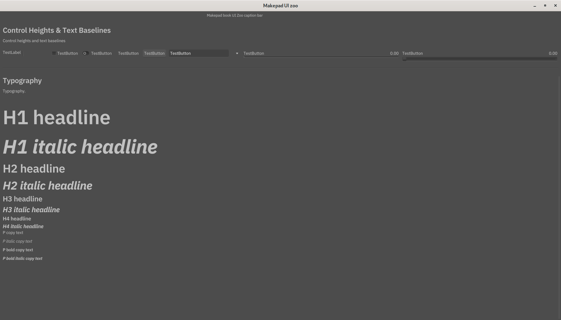
In this case, flow for buttons is right so you could see these buttons are align in row. THEME_SPACE_2 is a constant. It is defined in the theme_mobile_light.rs file from makepad widget.
Code is available at branch 04
More Views
In this section we will show complex combination of views. As usual, we define a component that would show a color block. It would be a little bit different from classic view. The rounded view would have round corner instead of right angle:
1// define color of background container
2    COLOR_CONTAINER = (THEME_COLOR_D_1)
3
4    // define colors for demo blocks
5    DEMO_COLOR_1 = #8f0
6    DEMO_COLOR_2 = #0f8
7    DEMO_COLOR_3 = #80f
8
9    ZooBlock = <RoundedView> {
10        width: 50., height: 50.
11        margin: 0.,
12        spacing: 0.,
13
14        show_bg: true;
15        draw_bg: {
16            // return color based on position
17            fn get_color(self) -> vec4 {
18                return mix(self.color, self.color*0.5, self.pos.y);
19            }
20            // a float value for the corner radius
21            radius: (THEME_CONTAINER_CORNER_RADIUS)
22        }
23    }
What will get_color do? Well, This function provides a gradient effect to the color block. This mix function will return color base on position y, and it is a range from 0 to 1 from up to bottom. The color block will transition from self.color to self.color * 0.5 (a darker color), determined by self.pos.y. For example, if we set self.pos.y to 0, the block will be self.color.
Let's define a ZooHeader component that includes various nested views and descriptive components. You can adjust the flow, padding, spacing, and other fields to see how the nested views are rendered.
1<ZooHeader> {
2                    title = {text: "<View>" }
3                    <ZooDesc> {text:"This is a gray view with flow set to Right\nTo show the extend, the background has been enabled using show_bg and a gray pixelshader has been provided to draw_bg."}
4                    <View> {
5                        height: Fit
6                        flow: Right,
7                        show_bg: true,
8                        draw_bg: { color: (COLOR_CONTAINER) }
9                        padding: 10.
10                        spacing: 10.
11                        <ZooBlock> {draw_bg:{color: (DEMO_COLOR_1)}}
12                        <ZooBlock> {draw_bg:{color: (DEMO_COLOR_2)}}
13                        <ZooBlock> {draw_bg:{color: (DEMO_COLOR_3)}}
14                    }
15
16                    <ZooDesc> {text:"This utlizes a <Filler> to separate items."}
17                    <View> {
18                        height: Fit
19                        flow: Right,
20                        show_bg: true,
21                        draw_bg: { color: (COLOR_CONTAINER) }
22                        padding: 10.
23                        spacing: 10.
24                        <ZooBlock> {draw_bg:{color: (DEMO_COLOR_1)}}
25                        <Filler> {} // placeholder
26                        <ZooBlock> {draw_bg:{color: (DEMO_COLOR_2)}}
27                        <ZooBlock> {draw_bg:{color: (DEMO_COLOR_3)}}
28                    }
29
30                    <ZooDesc> {text:"This view is bigger on the inside"}
31                    <View> {
32                        width: 150, height: 150,
33                        flow: Right,
34                        padding: 10.
35                        spacing: 10.
36
37                        show_bg: true,
38                        draw_bg: { color: (COLOR_CONTAINER) }
39                        scroll_bars: <ScrollBars> {}
40
41                        <View> {
42                            width: Fit, height: Fit,
43                            flow: Down,
44                            show_bg: false,
45                            spacing: 10
46                            <ZooBlock> {draw_bg:{color: (DEMO_COLOR_1)}}
47                            <ZooBlock> {draw_bg:{color: (DEMO_COLOR_2)}}
48                            <ZooBlock> {draw_bg:{color: (DEMO_COLOR_3)}}
49                            <ZooBlock> {draw_bg:{color: (DEMO_COLOR_2)}}
50                        }
51
52                        <View> {
53                            width: Fit, height: Fit,
54                            flow: Down,
55                            show_bg: false,
56                            spacing: 10
57                            <ZooBlock> {draw_bg:{color: (DEMO_COLOR_1)}}
58                            <ZooBlock> {draw_bg:{color: (DEMO_COLOR_2)}}
59                            <ZooBlock> {draw_bg:{color: (DEMO_COLOR_3)}}
60                            <ZooBlock> {draw_bg:{color: (DEMO_COLOR_2)}}
61                        }
62
63                        <View> {
64                            width: Fit, height: Fit,
65                            flow: Down,
66                            show_bg: false,
67                            <ZooBlock> {draw_bg:{color: (DEMO_COLOR_1)}}
68                            <ZooBlock> {draw_bg:{color: (DEMO_COLOR_2)}}
69                            <ZooBlock> {draw_bg:{color: (DEMO_COLOR_3)}}
70                            <ZooBlock> {draw_bg:{color: (DEMO_COLOR_2)}}
71                        }
72
73                        <View> {
74                            width: Fit, height: Fit,
75                            flow: Down,
76                            show_bg: false,
77                            spacing: 10
78                            <ZooBlock> {draw_bg:{color: (DEMO_COLOR_1)}}
79                            <ZooBlock> {draw_bg:{color: (DEMO_COLOR_2)}}
80                            <ZooBlock> {draw_bg:{color: (DEMO_COLOR_3)}}
81                            <ZooBlock> {draw_bg:{color: (DEMO_COLOR_2)}}
82                        }
83
84                        <View> {
85                            width: Fit, height: Fit,
86                            flow: Down,
87                            show_bg: false,
88                            spacing: 10
89                            <ZooBlock> {draw_bg:{color: (DEMO_COLOR_1)}}
90                            <ZooBlock> {draw_bg:{color: (DEMO_COLOR_2)}}
91                            <ZooBlock> {draw_bg:{color: (DEMO_COLOR_3)}}
92                        }
93                    }
94                }
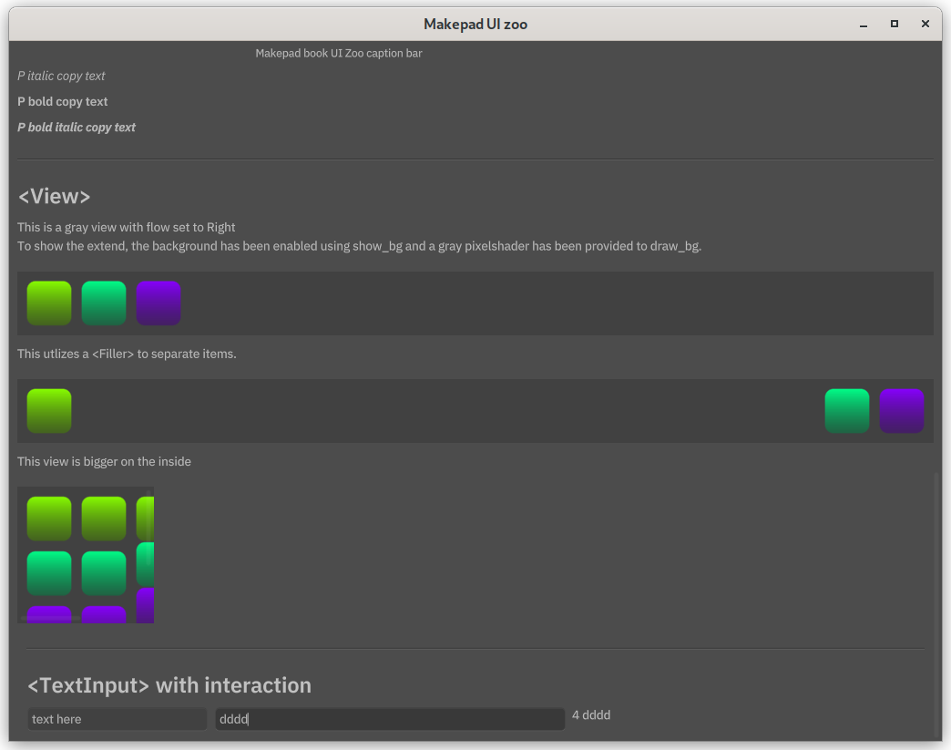
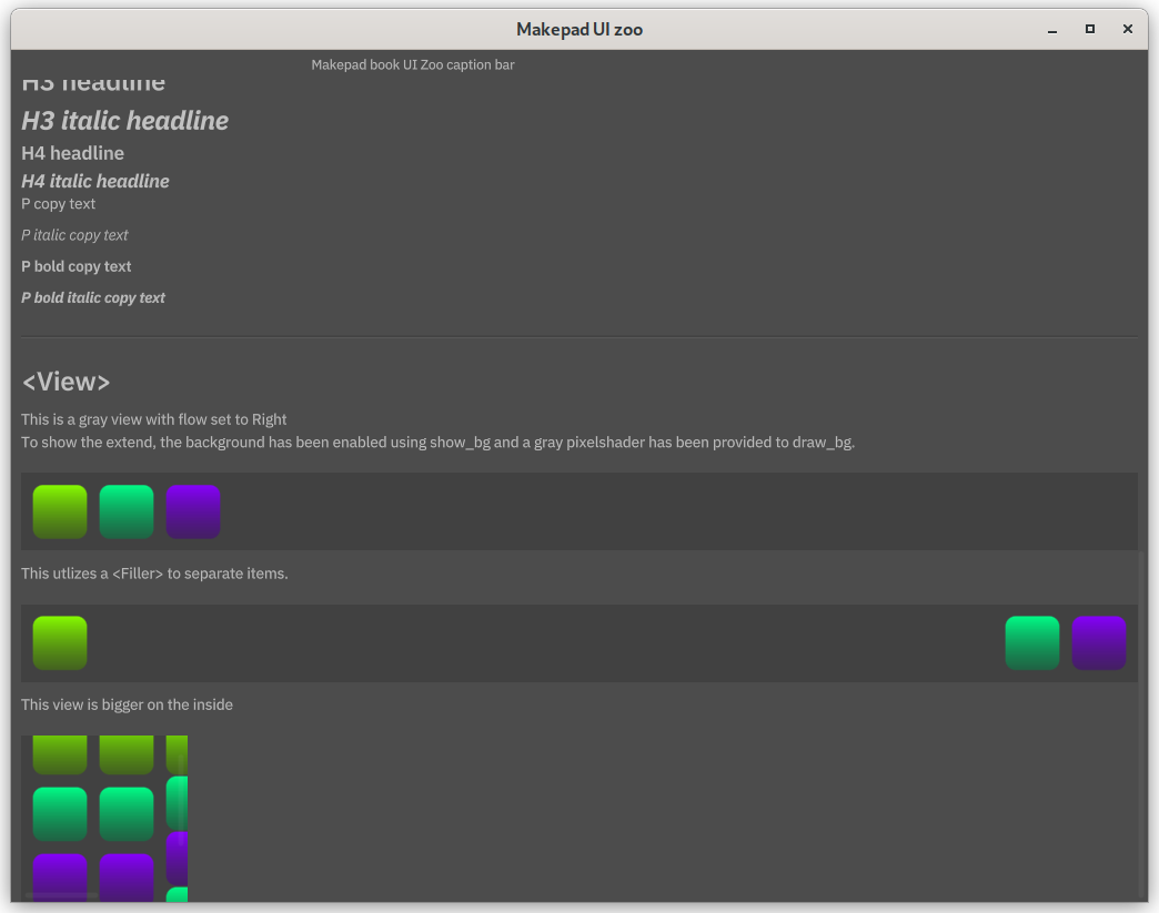 The bigger view inside smaller view also use scroll bar component to move.
The code is available here.
Interaction
We need to make the interface dynamic, so it can respond properly to user input. That way, we can fully utilize all the features of Makepad. Now, let's introduce the text input box and see how it works with the handle event to give dynamic feedback.
Text input
1pub struct App {
2    #[live]
3    ui: WidgetRef, // UI component reference
4    #[rust] counter: usize  // use rust instead of live for counter
5}
6
7// Implement LiveRegister trait for registering live design
8impl LiveRegister for App {
9    fn live_register(cx: &mut Cx) {
10        // Register Makepad Widgets' live design
11        makepad_widgets::live_design(cx);
12    }
13}
14
15impl MatchEvent for App{
16    fn handle_actions(&mut self, cx: &mut Cx, actions:&Actions){
17    if let Some(txt) = self.ui.text_input(id!(simpletextinput)).changed(&actions){  // when text input changes
18        log!("TEXTBOX CHANGED {}", self.counter);   // output to console
19        self.counter += 1;
20        let lbl = self.ui.label(id!(simpletextinput_outputbox));
21        lbl.set_text(cx,&format!("{} {}" , self.counter, txt));
22    }
23}
24}
25
26// Implement AppMain trait for handling events
27impl AppMain for App {
28    fn handle_event(&mut self, cx: &mut Cx, event: &Event) {
29        self.match_event(cx, event);
30        self.ui.handle_event(cx, event, &mut Scope::empty());
31    }
32}
#[rust] counter: usize The counter is set to count the time of user input. [rust] Means the counter is defined by rust no live system. Because there will be more events we need to handle in future, put them into MatchEvent. This event logs the change, increments a counter. And updates a label with the new text and the counter value whenever the text in the input field changes. The ID, or we can call the named is used to located specific component.
Let's define textinput boxes above:
1<ZooHeader> {
2                    title = {text:"<TextInput> with interaction"}
3                    padding: 10.
4                        <View> {
5                            height: Fit, width: Fill,
6                            spacing: (THEME_SPACE_2),
7                            textalreadyfilled = <TextInput> {
8                                text: "text here"
9                            }
10                            simpletextinput = <TextInput> { // simpletextinput is the id
11                                width: Fill,
12                             empty_message: "input" }
13                             // chanagble output box
14                            simpletextinput_outputbox = <P> {
15                                text: "Output"
16                            }
17                        }
18                }
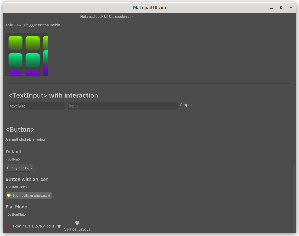
Two text input boxes are defined, and the change of second one will also change the label aside. The label will show the content of box and counter variable which count user input. Take these two code snippets together, you will know how event works.
Buttons
We could also try event in button component. Not only the text but also image is supported by using <ButtonIcon> instead of common <Button>. But we define a <ZooGroup> at first to group up component:
1ZooGroup = <RoundedView> {
2        height: Fit, width: Fill,
3        flow: Right,
4        align: { x: 0.0, y: 0.5},
5        margin: 0.,
6        show_bg: false;
7        draw_bg: { color: (COLOR_CONTAINER) }
8    }
And add these buttons. We use image by placing the svg file in the resources folder, which is at the same level as the src folder. You could find the image here. The image could be colored by using color field. Also flat button is introduced, it does not have a prominent border and background color.
1<ZooHeader> {
2                    title = {text:"<Button>"}
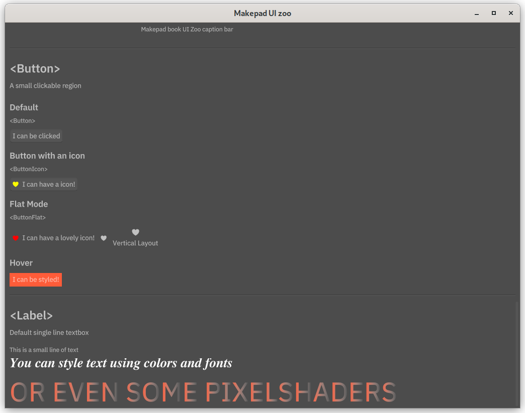
3                    <ZooDesc> {text:"A small clickable region"}
4                    <ZooGroup> {
5                        flow: Down,
6                        width: Fill, height: Fit,
7                        align: { x: 0.0, y: 0.5 }
8                        spacing: 10.,
9
10                        <H4> { text: "Default"}
11                        <Label> { text: "<Button>"}
12                        basicbutton = <Button> { text: "I can be clicked" }
13
14                        <H4> { text: "Button with an icon"}
15                        <Label> { text: "<ButtonIcon>"}
16                        iconbutton = <ButtonIcon> {
17                            draw_icon: {
18                                color: #ff0,
19                                svg_file: dep("crate://self/resources/Icon_Favorite.svg"),
20                            }
21                            text: "I can have a icon!"
22                        }
23
24                        <H4> { text: "Flat Mode"}
25                        <Label> { text: "<ButtonFlat>"}
26                        <View> {
27                            flow: Right,
28                            align: { x: 0., y: 0.5 }
29                            width: Fill, height: Fit,
30                            <ButtonFlat> {
31                                draw_icon: {
32                                    color: #f00,
33                                    svg_file: dep("crate://self/resources/Icon_Favorite.svg"),
34                                }
35                                text: "I can have a lovely icon!"
36                            }
37
38                            <ButtonFlat> {
39                                draw_icon: {
40                                    svg_file: dep("crate://self/resources/Icon_Favorite.svg"),
41                                }
42                            }
43
44                            <ButtonFlat> {
45                                flow: Down,
46                                icon_walk: { width: 15. }
47                                draw_icon: {
48                                    svg_file: dep("crate://self/resources/Icon_Favorite.svg"),
49                                }
50                                text: "Vertical Layout"
51                            }
52                        }
53                    }
54                }
The icon_walk defines how the "walks" within its parent container, determining its own size and position. For the further information about layout and walk please check layout system.
Now let's handle the event.
1if let Some(txt) = self.ui.text_input(id!(simpletextinput)).changed(&actions){  // when text input changes
2        log!("TEXTBOX CHANGED {}", self.counter);   // output to console
3        self.counter += 1;
4        let lbl = self.ui.label(id!(simpletextinput_outputbox));
5        lbl.set_text(cx,&format!("{} {}" , self.counter, txt));
6    }
7
8    if self.ui.button(id!(basicbutton)).clicked(&actions) {
9        log!("BASIC BUTTON CLICKED {}", self.counter);
10        self.counter += 1;
11        let btn = self.ui.button(id!(basicbutton));
12        btn.set_text(cx,&format!("Clicky clicky! {}", self.counter));
13    }
14
15    if self.ui.button(id!(iconbutton)).clicked(&actions) {
16        log!("ICON BUTTON CLICKED {}", self.counter);
17        self.counter += 1;
18        let btn = self.ui.button(id!(iconbutton));
19        btn.set_text(cx,&format!("Icon button clicked: {}", self.counter));
20    }
The counter is used to count the total click times, it is shared by all the buttons and text box. If you want to set counter seperatly, you could use different variable.
Makepad can treat with hover too. Let's see how the text color changed when cursor above the button:
1<H4> { text: "Hover"}
2                            styledbutton = <Button> {
3                                draw_bg: {
4                                    fn pixel(self) -> vec4 {
5                                        return (THEME_COLOR_MAKEPAD) + self.pressed * vec4(1., 1., 1., 1.)
6                                    }
7                                }
8                                draw_text: {
9                                    fn get_color(self) -> vec4 {
10                                        return (THEME_COLOR_U_5) - vec4(0., 0.1, 0.4, 0.) * self.hover - self.pressed * vec4(1., 1., 1., 0.);
11                                    }
12                                }
13                                text: "I can be styled!"
14                            }
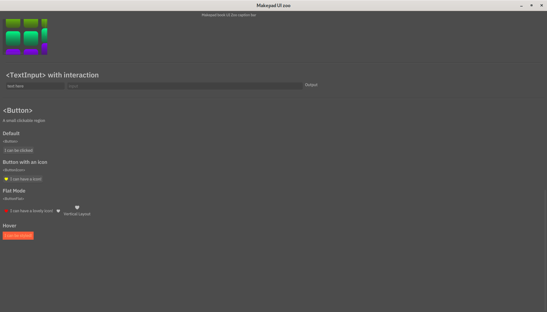
No need to change the match event for this one. self.hover is a bool value that make text color changed when the cursor is above. Also when the button is clicked, the background color and text color also changed.
It's a bit uncleared but the text color change to orange instead of white when it is hover.
The code is available here.
Text with fonts and color
We introduce text display at very beginning, but now for the more advance use~ Both font and size can be customize:
1<ZooHeader> {
2                    title = {text:"<Label>"}
3                    <ZooDesc> { text:"Default single line textbox" }
4                    <ZooGroup> { <Label> { text: "This is a small line of text" } }
5                    <ZooGroup> {
6                        <Label> {
7                            draw_text: {
8                                color: #fff,
9                                text_style: {
10                                    font: {path: dep("crate://self/resources/XITSOneText-BoldItalic.ttf")},
11                                    font_size: 20,
12                                }
13                            },
14                            text: "You can style text using colors and fonts"
15                        }
16                    }
17                    <ZooGroup> {
18                        <Label> {
19                            draw_text: {
20                                fn get_color(self) ->vec4{
21                                    return mix((THEME_COLOR_MAKEPAD), (THEME_COLOR_U_HIDDEN), self.pos.x)
22                                }
23                                color: (THEME_COLOR_MAKEPAD)
24                                text_style: {
25                                    font_size: 40.,
26                                }
27                            },
28                            text: "OR EVEN SOME PIXELSHADERS"
29                        }
30                    }
31                }
The font use in example is available here. You can change it by your own but not all of the font support well. For the final line, we use same way as draw_bg in section More Views. Just consider every single letter as a color block, but mix them horizontally instead of vertically.
Working branch is available here.
Sliders
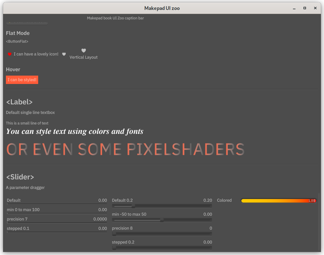
A Slider is a user interface element that allows users to select a value by dragging a handle along a track. Sliders are commonly used to adjust parameters or set values within a range.
Common Slider
There are several parameters can define. Using draw_slider define the left and right color of slider.
1<ZooHeader> {
2                    title = { text:"<Slider>" }
3                    <ZooDesc> { text:"A parameter dragger" }
4                    <ZooGroup> {
5                        width: Fill, height: Fit,
6                        flow: Right,
7                        spacing: 10.0,
8                        align: { x: 0., y: 0.}
9                        <View> {
10                            width: Fill, height: Fit,
11                            flow: Down,
12                            <Slider> { text: "Default" }
13                            <Slider> { text: "min 0 to max 100", min: 0., max: 100. }
14                            <Slider> { text: "precision 7", precision: 4 }  // max precision
15                            <Slider> { text: "stepped 0.1", step: 0.1 }
16                        }
17                        <View> {
18                            width: Fill, height: Fit,
19                            flow: Down,
20                            <SliderBig> { text: "Default 0.2", default: 0.2 }
21                            <SliderBig> { text: "min -50 to max 50", min: -50, max: 50. }
22                            <SliderBig> { text: "precision 8", precision: 8 }   // when greater than 7, auto jump to 16 and won't changed
23                            <SliderBig> { text: "stepped 0.2", step: 0.2 }
24                        }
25                        <View> {
26                            width: Fill, height: Fit,
27                            flow: Down,
28                            <SliderAlt1> {
29                                text: "Colored",
30                                draw_slider: {
31                                    val_color_a: (#FFCC00),
32                                    val_color_b: #f00,
33                               }
34                            }
35                        }
36                    }
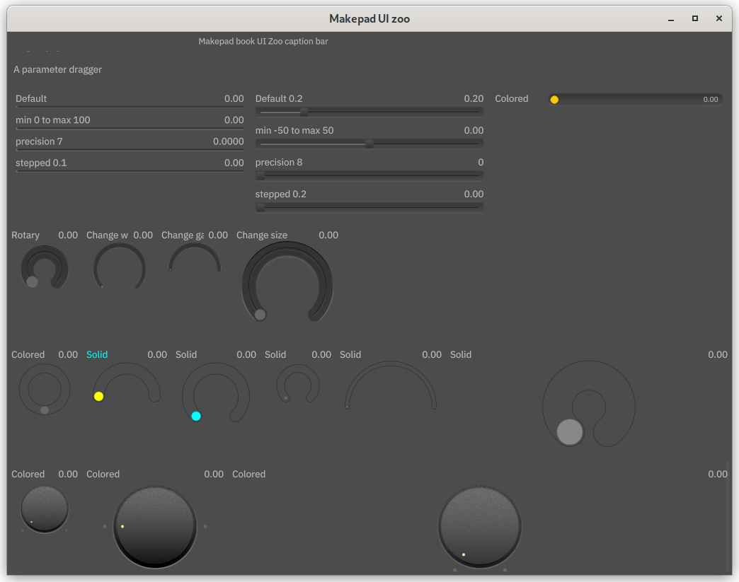
Rotary slider
The slider can not only be used in a straight line but also has a curved version. You can think of this circular slider as a vertical slider. This one is quite similar to the common slider but using different component name.
You can see the code from github branch 08.
Drop Down
It seems that work without enum (and what is mean by databound?)
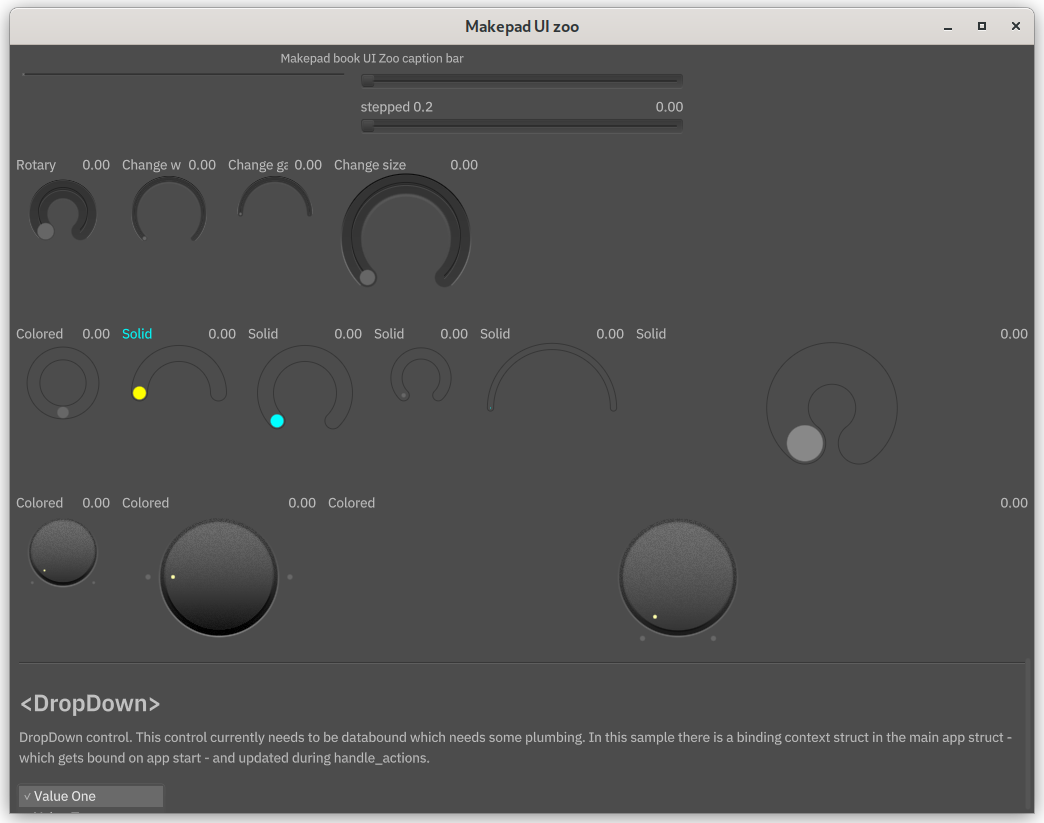
We can define a drop down menu by directing using <DropDown> component:
1<ZooHeader> {
2                    title = {text:"<DropDown>"}
3                    <ZooDesc> {text:"DropDown control. This control currently needs to be databound which needs some plumbing. In this sample there is a binding context struct in the main app struct - which gets bound on app start - and updated during handle_actions."}
4                    <ZooGroup> {
5                        dropdown = <DropDown> {
6                            labels: ["Value One", "Value Two", "Thrice", "Fourth Value", "Option E", "Hexagons"],
7                            values: [ValueOne, ValueTwo, Thrice, FourthValue, OptionE, Hexagons]
8                        }
9                    }
10                }
It is quite straight forward to match display text label and values. But be careful, the expanded menu may be out of the windows and can't be reached.
So put a placeholder under it:
1<ZooHeader> {
2                    title = {text:"Place holder"}
3                    <ZooDesc> {text:"Place holder for drop down"}
4
5                }
We can get the index and label by using event_handle:
1fn handle_actions(&mut self, cx: &mut Cx, actions:&Actions){
2        // Handle DropDown selection change
3        if let Some(selected) = self.ui.drop_down(id!(dropdown)).changed(&actions) {
4            log!("DROPDOWN SELECTED index {}", selected);
5            let selected_label = self.ui.drop_down(id!(dropdown)).selected_label();
6            log!("DROPDOWN SELECTED label {}", selected_label);
7        }
These codes means when the selection is changed, it will print out the selected label and index. Let's see the output:
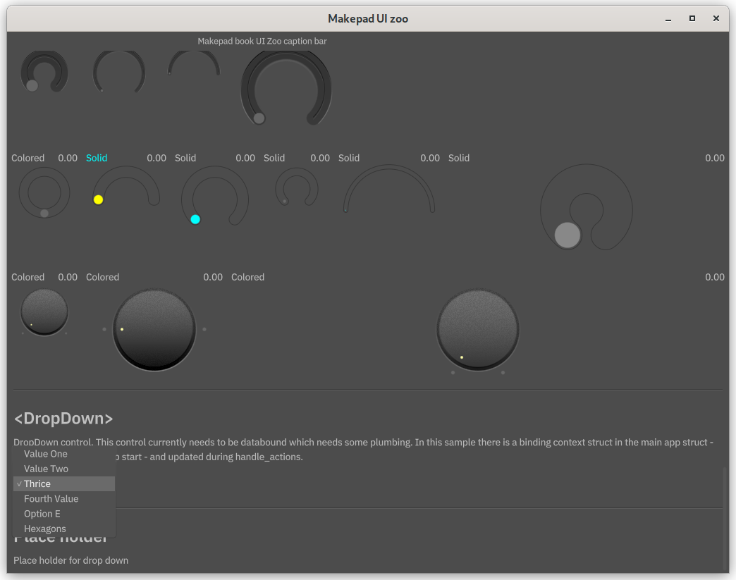

1src/app.rs:602:13 - DROPDOWN SELECTED index 2
2src/app.rs:604:13 - DROPDOWN SELECTED label Thrice
HTML and Markdown
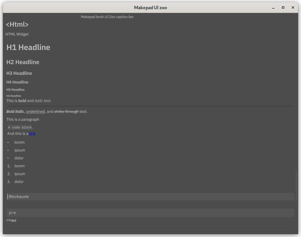
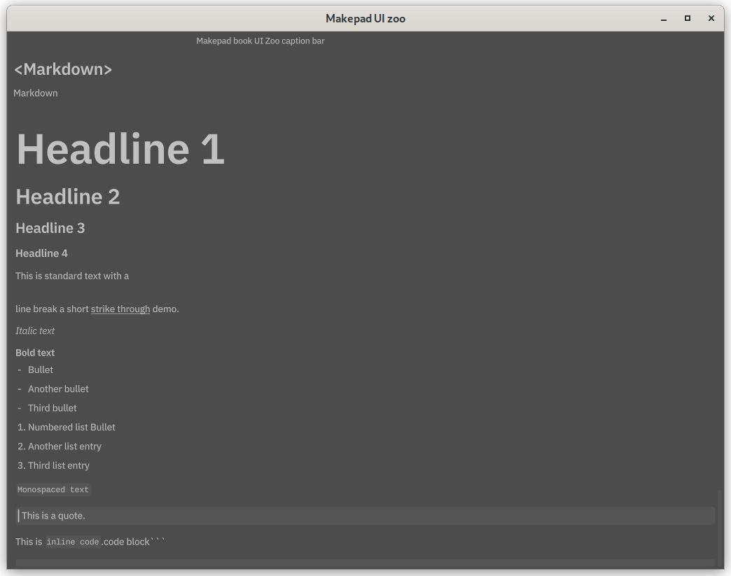
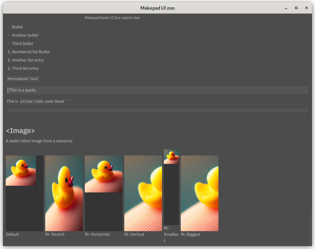
Makepad also support HTML and Markdown language. If you need to use them in your application, simply include them into correct component. But the link label is not working now, you can't open google by clicking the link. It won't be fixed in the future, so to implement by your own, You could also check robius-open project.
1<ZooHeader> {
2 title = {text:"<Html>"}
3 <ZooDesc> {text:"HTML Widget"}
4 <ZooGroup> {
5 <Html> {
6 width:Fill, height:Fit,
7 body:"<H1>H1 Headline</H1><H2>H2 Headline</H2><H3>H3 Headline</H3><H4>H4 Headline</H4><H5>H5 Headline</H5><H6>H6 Headline</H6>This is <b>bold</b> and <i>italic text</i>.<sep><b><i>Bold italic</i></b>, <u>underlined</u>, and <s>strike through</s> text. <p>This is a paragraph</p> <code>A code block</code>. <br/> And this is a <a href='https://www.google.com/'>link</a><br/><ul><li>lorem</li><li>ipsum</li><li>dolor</li></ul><ol><li>lorem</li><li>ipsum</li><li>dolor</li></ol><br/> <blockquote>Blockquote</blockquote> <pre>pre</pre><sub>sub</sub><del>del</del>"
8 }
9 }
10 }
11
12 <ZooHeader> {
13 title = {text:"<Markdown>"}
14 <ZooDesc> {text:"Markdown"}
15 <ZooGroup> {
16 <Markdown> {
17 width:Fill, height: Fit,
18 body:"# Headline 1 \n ## Headline 2 \n ### Headline 3 \n #### Headline 4 \n This is standard text with a \n\n line break a short ~~strike through~~ demo.\n\n *Italic text* \n\n **Bold text** \n\n - Bullet\n - Another bullet\n\n - Third bullet\n\n 1. Numbered list Bullet\n 2. Another list entry\n\n 3. Third list entry\n\n `Monospaced text`\n\n> This is a quote.\n\nThis is `inline code`.\n\n ```code block
19 ```"
20 }
21 }
22 }
For now we will print url when you click it.
1impl MatchEvent for App{
2    fn handle_actions(&mut self, cx: &mut Cx, actions:&Actions){
3        for action in actions.iter() {
4            if let HtmlLinkAction::Clicked { url, .. } = action.as_widget_action().cast() {
5                  //robius_open::Uri::new(&url).open()
6                  log!("URL CLICKED: {}", url);
7            }
8        }
And these are following output:
1src/app.rs:602:19 - URL CLICKED: https://www.google.com/
Image
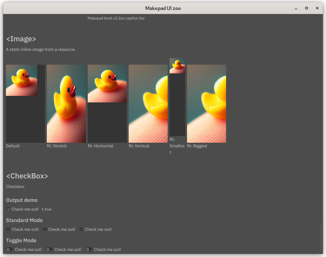
Loading and display an image is similar as loading a specific font for text. We put duck image into resources foler, too.
1<ZooHeader> {
2                    title = {text:"<Image>"}
3                    <ZooDesc> {text:"A static inline image from a resource."}
4                    <ZooGroup> {
5                        height: Fit, width: Fill,
6                        spacing: (THEME_SPACE_2)
7                        scroll_bars: <ScrollBars> {}
8                        <View> {
9                            width: Fit, height: Fit, flow: Down,
10                            <View> {
11                                show_bg: true, draw_bg: { color: (THEME_COLOR_BG_CONTAINER)}, width: 125, height: 250, flow: Down,
12                                <Image> { source: dep("crate://self/resources/ducky.png" ) }
13                            }
14                            <P> { text: "Default" }
15                        }
16                        <View> {
17                            width: Fit, height: Fit, flow: Down,
18                            <View> {
19                                show_bg: true, draw_bg: { color: (THEME_COLOR_BG_CONTAINER)}, width: 125, height: 250,
20                                <Image> { height: Fill, source: dep("crate://self/resources/ducky.png" ), min_height: 100 }
21                            }
22                            <P> { text: "min_height: 100" } // TODO: get this to work correctly
23                        }
24                        <View> {
25                            width: Fit, height: Fit, flow: Down,
26                            <View> {
27                                show_bg: true, draw_bg: { color: (THEME_COLOR_BG_CONTAINER)}, width: 125, height: 250,
28                                <Image> { width: Fill, source: dep("crate://self/resources/ducky.png" ), width_scale: 1.1 }
29                            }
30                            <P> { text: "width_scale: 1.5" } // TODO: get this to work correctly
31                        }
32                        <View> {
33                            width: Fit, height: Fit, flow: Down,
34                            <View> {
35                                show_bg: true, draw_bg: { color: (THEME_COLOR_BG_CONTAINER)}, width: 125, height: 250,
36                                <Image> { width: Fill, height: Fill, source: dep("crate://self/resources/ducky.png"), fit: Stretch }
37                            }
38                            <P> { text: "fit: Stretch" }
39                        }
40                        <View> {
41                            width: Fit, height: Fit, flow: Down,
42                            <View> {
43                                show_bg: true, draw_bg: { color: (THEME_COLOR_BG_CONTAINER)}, width: 125, height: 250,
44                                <Image> { width: Fill, height: Fill, source: dep("crate://self/resources/ducky.png" ), fit: Horizontal }
45                            }
46                            <P> { text: "fit: Horizontal" }
47                        }
48                        <View> {
49                            width: Fit, height: Fit, flow: Down,
50                            <View> {
51                                show_bg: true, draw_bg: { color: (THEME_COLOR_BG_CONTAINER)}, width: 125, height: 250,
52                                <Image> { width: Fill, height: Fill, source: dep("crate://self/resources/ducky.png" ), fit: Vertical }
53                            }
54                            <P> { text: "fit: Vertical" }
55                        }
56                        <View> {
57                            width: Fit, height: Fit, flow: Down,
58                            <View> {
59                                show_bg: true, draw_bg: { color: (THEME_COLOR_BG_CONTAINER)}, width: 125, height: 250,
60                                <Image> { width: Fill, height: Fill, source: dep("crate://self/resources/ducky.png" ), fit: Smallest }
61                            }
62                            <P> { text: "fit: Smallest" }
63                        }
64                        <View> {
65                            width: Fit, height: Fit, flow: Down,
66                            <View> {
67                                show_bg: true, draw_bg: { color: (THEME_COLOR_BG_CONTAINER)}, width: 125, height: 250,
68                                <Image> { width: Fill, height: Fill, source: dep("crate://self/resources/ducky.png" ), fit: Biggest }
69                            }
70                            <P> { text: "fit: Biggest" }
71                        }
72                    }
73                }
We need a view component that include image. This image could be stretch and fit to longest edge, shortest edge. Or fit into the vertical or the horizontal edge.
Check box
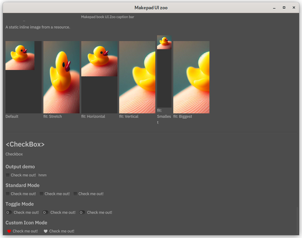
These include multiple nested views and checkbox components to demonstrate different checkbox modes. The check can also bind to event just like button.
1<ZooHeader> {
2                    title = {text:"<CheckBox>"}
3                    <ZooDesc> {text:"Checkbox"}
4                    <ZooGroup> {
5                        height: Fit
6                        spacing: (THEME_SPACE_2)
7                        flow: Down,
8                        <H4> { text: "Output demo"}
9                        <View> {
10                            height: Fit
11                            flow: Right
12                            align: { x: 0.0, y: 0.5}
13                            simplecheckbox = <CheckBox> {text:"Check me out!"}
14                            simplecheckbox_output = <Label> { text:"hmm" }
15                        }
16                        <H4> { text: "Standard Mode"}
17                        <View> {
18                            height: Fit
19                            flow: Right
20                            spacing: (THEME_SPACE_1)
21                            align: { x: 0.0, y: 0.5}
22                            <CheckBox> {text:"Check me out!"}
23                            <CheckBox> {text:"Check me out!"}
24                            <CheckBox> {text:"Check me out!"}
25                        }
26                        <H4> { text: "Toggle Mode"}
27                        <View> {
28                            height: Fit
29                            flow: Right
30                            spacing: (THEME_SPACE_1)
31                            align: { x: 0.0, y: 0.5}
32                            <CheckBoxToggle> {text:"Check me out!" }
33                            <CheckBoxToggle> {text:"Check me out!" }
34                            <CheckBoxToggle> {text:"Check me out!" }
35                        }
36                    }
37                }
Bind the checkbox in event. When the check box is clicked, label aside will changed.
1if let Some(check) = self.ui.check_box(id!(simplecheckbox)).changed(actions) {
2        log!("CHECK BUTTON CLICKED {} {}", self.counter, check);
3        self.counter += 1;
4        let lbl = self.ui.label(id!(simplecheckbox_output));
5        lbl.set_text(cx,&format!("{} {}" , self.counter, check));
6    }
We can customize checkbox, too. Using the heart svg image we used in button.
1<H4> { text: "Custom Icon Mode"}
2                        <View> {
3                            height: Fit
4                            flow: Right
5                            spacing: (THEME_SPACE_1)
6                            align: { x: 0.0, y: 0.5}
7                            <CheckBoxCustom> {
8                                text:"Check me out!"
9                                draw_check: { check_type: None }
10                                draw_icon: {
11                                    color_active: #f00,
12                                    svg_file: dep("crate://self/resources/Icon_Favorite.svg"),
13                                }
14                            }
15                            <CheckBoxCustom> {
16                                text:"Check me out!"
17                                draw_check: { check_type: None }
18                                draw_icon: {
19                                    svg_file: dep("crate://self/resources/Icon_Favorite.svg"),
20                                }
21                            }
22                        }
We can also change icon color by using color_active field.
Radio button
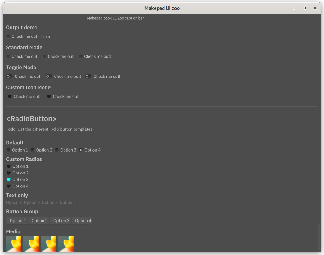
This is special type of buttons, only one button in the group can be selected. The first two group of buttons are similar to check box. And the text and image itself can also be the clickable area.
1<ZooHeader> {
2                    title = {text:"<RadioButton>"}
3                    <ZooDesc> {text:"Todo: List the different radio button templates."}
4                    <ZooGroup> {
5                        flow: Down,
6                        spacing: (THEME_SPACE_2)
7                        <H4> { text: "Default"}
8                        <View> {
9                            height: Fit
10                            flow: Right
11                            align: { x: 0.0, y: 0.5 }
12                            radios_demo = <View> {
13                                spacing: (THEME_SPACE_2)
14                                width: Fit, height: Fit,
15                                radio1 = <RadioButton> { text: "Option 1" }
16                                radio2 = <RadioButton> { text: "Option 2" }
17                                radio3 = <RadioButton> { text: "Option 3" }
18                                radio4 = <RadioButton> { text: "Option 4" }
19                            }
20                        }
21
22                        <H4> { text: "Custom Radios"}
23                        <View> {
24                            height: Fit
25                            flow: Right
26                            align: { x: 0.0, y: 0.5 }
27                            iconradios_demo = <View> {
28                                width: Fit, height: Fit,
29                                spacing: (THEME_SPACE_2)
30                                flow: Down,
31
32                                radio1 = <RadioButtonCustom> {
33                                    text: "Option 1"
34                                    icon_walk: {
35                                        width: 12.5, height: Fit,
36                                    }
37                                    draw_icon: {
38                                        svg_file: dep("crate://self/resources/Icon_Favorite.svg"),
39                                    }
40                                }
41                                radio2 = <RadioButtonCustom> {
42                                    text: "Option 2"
43                                    icon_walk: {
44                                        width: 12.5, height: Fit,
45                                    }
46                                    draw_icon: {
47                                        color_active: #0f0,
48                                        svg_file: dep("crate://self/resources/Icon_Favorite.svg"),
49                                    }
50                                }
51                                radio3 = <RadioButtonCustom> {
52                                    text: "Option 3"
53                                    icon_walk: {
54                                        width: 12.5, height: Fit,
55                                    }
56                                    draw_icon: {
57                                        color_active: #0ff,
58                                        svg_file: dep("crate://self/resources/Icon_Favorite.svg"),
59                                    }
60                                }
61                                radio4 = <RadioButtonCustom> {
62                                    text: "Option 4"
63                                    icon_walk: {
64                                        width: 12.5, height: Fit,
65                                    }
66                                    draw_icon: {
67                                        color_active: #f00,
68                                        svg_file: dep("crate://self/resources/Icon_Favorite.svg"),
69                                    }
70                                }
71                            }
72                        }
73
74                        <H4> { text: "Text only"}
75                        <View> {
76                            height: Fit
77                            flow: Right
78                            align: { x: 0.0, y: 0.5 }
79                            textonlyradios_demo = <View> {
80                                width: Fit, height: Fit,
81                                flow: Right,
82                                spacing: (THEME_SPACE_2)
83                                radio1 = <RadioButtonTextual> { text: "Option 1" }
84                                radio2 = <RadioButtonTextual> { text: "Option 2" }
85                                radio3 = <RadioButtonTextual> { text: "Option 3" }
86                                radio4 = <RadioButtonTextual> { text: "Option 4" }
87                            }
88                        }
89
90
91                        <H4> { text: "Button Group"}
92                        <ButtonGroup> {
93                            height: Fit
94                            flow: Right
95                            align: { x: 0.0, y: 0.5 }
96                            radiotabs_demo = <View> {
97                                width: Fit, height: Fit,
98                                radio1 = <RadioButtonTab> { text: "Option 1" }
99                                radio2 = <RadioButtonTab> { text: "Option 2" }
100                                radio3 = <RadioButtonTab> { text: "Option 3" }
101                                radio4 = <RadioButtonTab> { text: "Option 4" }
102                            }
103                        }
104
105                        <H4> { text: "Media"}
106                        <View> {
107                            height: Fit
108                            flow: Right
109                            align: { x: 0.0, y: 0.5 }
110                            mediaradios_demo = <View> {
111                                width: Fit, height: Fit,
112                                flow: Right,
113                                spacing: (THEME_SPACE_2)
114                                radio1 = <RadioButtonImage> {
115                                    width: 50, height: 50,
116                                    media: Image,
117                                    image: <Image> { source: dep("crate://self/resources/ducky.png" ) }
118                                }
119                                radio2 = <RadioButtonImage> {
120                                    width: 50, height: 50,
121                                    media: Image,
122                                    image: <Image> { source: dep("crate://self/resources/ducky.png" ) }
123                                }
124                                radio3 = <RadioButtonImage> {
125                                    width: 50, height: 50,
126                                    media: Image,
127                                    image: <Image> { source: dep("crate://self/resources/ducky.png" ) }
128                                }
129                                radio4 = <RadioButtonImage> {
130                                    width: 50, height: 50,
131                                    media: Image,
132                                    image: <Image> { source: dep("crate://self/resources/ducky.png" ) }
133                                }
134                            }
135                        }
136                    }
137                }
Only one buttons is the group can be selected, so the event is used again to change the visibility. Or the button can only be selected but can't be cancelled.
1impl MatchEvent for App{
2        fn handle_actions(&mut self, cx: &mut Cx, actions:&Actions){
3            let ui = self.ui.clone();
4
5        ui.radio_button_set(ids!(radios_demo.radio1, radios_demo.radio2, radios_demo.radio3, radios_demo.radio4))
6            .selected_to_visible(cx, &ui, actions, ids!(radios_demo.radio1, radios_demo.radio2, radios_demo.radio3, radios_demo.radio4));
7
8        ui.radio_button_set(ids!(iconradios_demo.radio1, iconradios_demo.radio2, iconradios_demo.radio3, iconradios_demo.radio4))
9            .selected_to_visible(cx, &ui, actions, ids!(iconradios_demo.radio1, iconradios_demo.radio2, iconradios_demo.radio3, iconradios_demo.radio4));
10
11        ui.radio_button_set(ids!(radiotabs_demo.radio1, radiotabs_demo.radio2, radiotabs_demo.radio3, radiotabs_demo.radio4))
12            .selected_to_visible(cx, &ui, actions, ids!(radiotabs_demo.radio1, radiotabs_demo.radio2, radiotabs_demo.radio3, radiotabs_demo.radio4));
13
14        ui.radio_button_set(ids!(textonlyradios_demo.radio1, textonlyradios_demo.radio2, textonlyradios_demo.radio3, textonlyradios_demo.radio4))
15            .selected_to_visible(cx, &ui, actions, ids!(textonlyradios_demo.radio1, textonlyradios_demo.radio2, textonlyradios_demo.radio3, textonlyradios_demo.radio4));
16
17        ui.radio_button_set(ids!(mediaradios_demo.radio1, mediaradios_demo.radio2, mediaradios_demo.radio3, mediaradios_demo.radio4))
18            .selected_to_visible(cx, &ui, actions, ids!(mediaradios_demo.radio1, mediaradios_demo.radio2, mediaradios_demo.radio3, mediaradios_demo.radio4));
We are using ids! instead of id! here.
The id! macro is used to generate an identifier for a single component, and ids! macro is used to generate a set of identifiers for multiple components.
Slides View
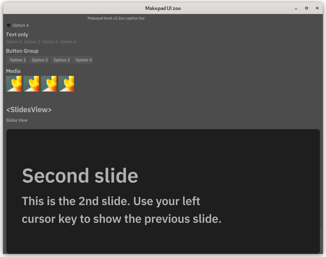
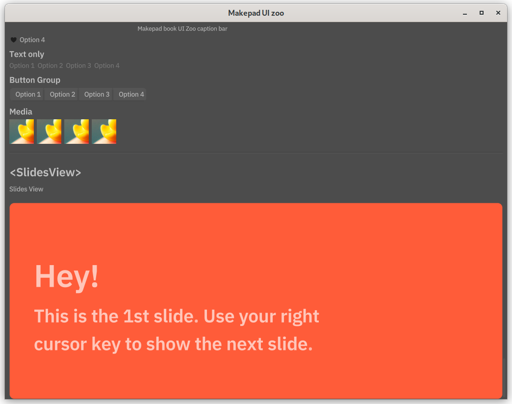
Makepad could easily build PPT like slides. The <SlideChapter> will set background into orange color, and <Slide> background is black.
1<ZooHeader> {
2                    title = {text:"<SlidesView>"}
3                    width: Fill, height: Fit,
4                    <ZooDesc> {text:"Slides View"}
5                    <View> {
6                        width: Fill, height: Fit,
7                        <SlidesView> {
8                            width: Fill, height: 400,
9
10                            <SlideChapter> {
11                                title = {text: "Hey!"},
12                                <SlideBody> {text: "This is the 1st slide. Use your right\ncursor key to show the next slide."}
13                            }
14
15                            <Slide> {
16                                title = {text: "Second slide"},
17                                <SlideBody> {text: "This is the 2nd slide. Use your left\ncursor key to show the previous slide."}
18                            }
19
20                        }
21                    }
22                }
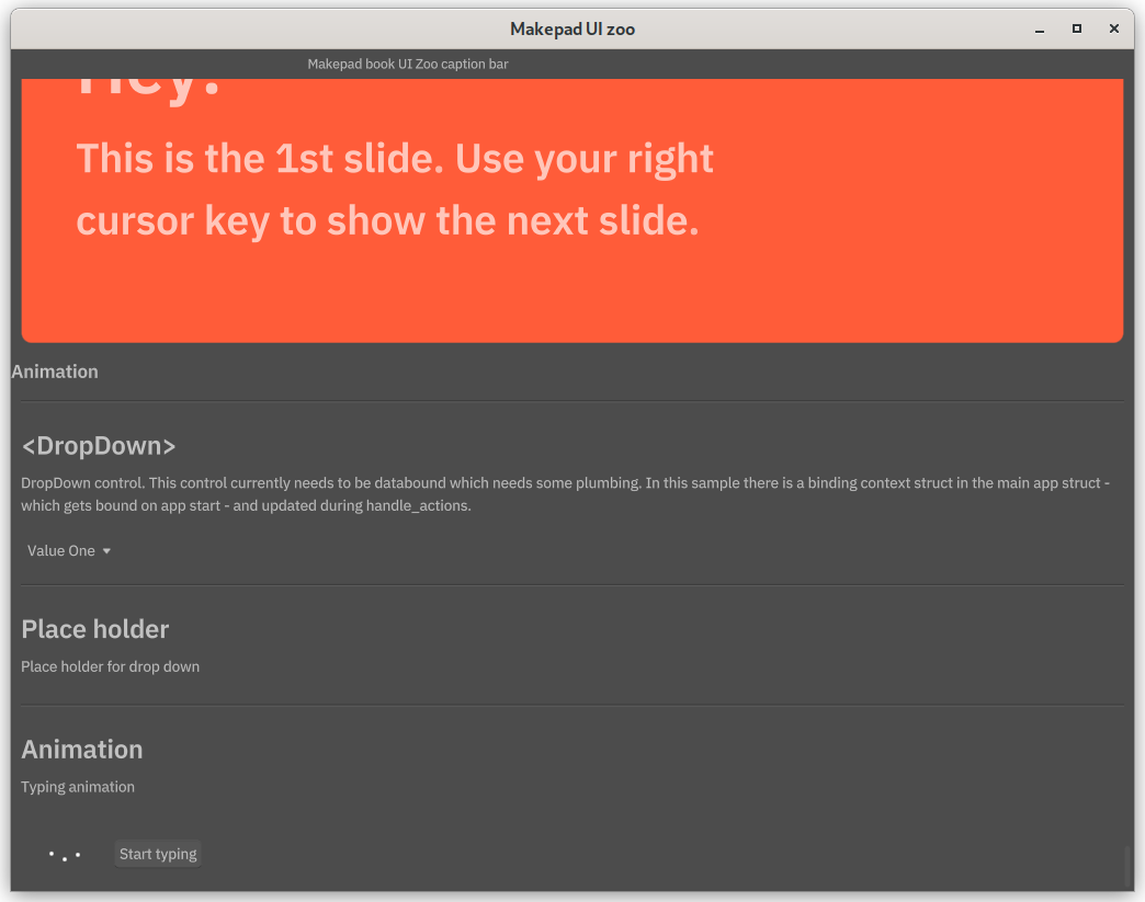
The slide chapter:
 Common slide:

Animation
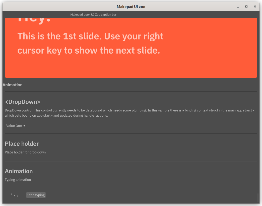
We can play animation in Makepad. We use typing animation component in robrix. This animation is three dots bounsing in sine wave:
We need to separate a new file to draw this animation.
typing_animation.rs
1use makepad_widgets::*;
2
3live_design! {
4    use link::theme::*;
5    use link::shaders::*;
6    use link::widgets::*;
7
8    pub TypingAnimation = {{TypingAnimation}} {
9        width: 48,
10        height: 24,
11        flow: Down,
12        show_bg: true,
13        draw_bg: {
14            color: #000
15            uniform freq: 5.0,  // Animation frequency
16            uniform phase_offset: 102.0, // Phase difference
17            uniform dot_radius: 2.5, // Dot radius
18            uniform thetime: 0.0,
19            fn pixel(self) -> vec4 {
20                let sdf = Sdf2d::viewport(self.pos * self.rect_size);
21                let amplitude = self.rect_size.y * 0.22;
22                let center_y = self.rect_size.y * 0.5;
23                // Create three circle SDFs
24                sdf.circle(
25                    self.rect_size.x * 0.25,    // dot will be at 1/4 of the width
26                    amplitude * sin(self.thetime * self.freq) + center_y,   //  using time to calculate the y position
27                    self.dot_radius // dot radius
28                );
29                sdf.fill(self.color);
30                sdf.circle(
31                    self.rect_size.x * 0.5, // dot will be at 1/2 of the width
32                    amplitude * sin(self.thetime * self.freq + self.phase_offset) + center_y,
33                    self.dot_radius
34                );
35                sdf.fill(self.color);
36                sdf.circle(
37                    self.rect_size.x * 0.75,    // dot will be at 3/4 of the width
38                    amplitude * sin(self.thetime * self.freq + self.phase_offset * 2) + center_y,
39                    self.dot_radius
40                );
41                sdf.fill(self.color);
42                return sdf.result;
43            }
44        }
45    }
46}
47
48#[derive(Live, LiveHook, Widget)]
49pub struct TypingAnimation {
50    #[deref] view: View,
51    #[rust] next_frame: NextFrame,
52    #[rust] is_play: bool,  // flag to play or stop the animation
53}
We use the time to calculate y position of the dots. Three dots are printed in static x position and changing y position relates on time.
So how can we start this animation? Well, we need to render
1impl Widget for TypingAnimation {
2    fn handle_event(&mut self, cx: &mut Cx, event: &Event, scope: &mut Scope) {
3
4        if let Some(ne) = self.next_frame.is_event(event) {
5            let time = ((ne.time * 10.0).round() as u32 % 360) as f32;
6            self.draw_bg.set_uniform(cx, id!(thetime), &[time as f32]);
7            self.redraw(cx);    // redraw the widget
8            if !self.is_play {
9                return  // stop the animation
10            }
11            self.next_frame = cx.new_next_frame();
12        }
13
14        self.view.handle_event(cx, event, scope);
15    }
16
17    fn draw_walk(&mut self, cx: &mut Cx2d, scope: &mut Scope, walk: Walk) -> DrawStep {
18        self.view.draw_walk(cx, scope, walk)
19    }
20}
We get the time and pass the uniform parameters into it. Then call the redraw of current component. Then it will check the is_play variable, if not playing directly return instead of renerding new next frame. By stopping render next frame, the whole animation will stop. The codes above basically is the main part of animation. Now let's implement the start and stop function.
1impl TypingAnimationRef {
2    /// Starts animation of the bouncing dots.
3    pub fn animate(&self, cx: &mut Cx) {
4        if let Some(mut inner) = self.borrow_mut() {
5            inner.is_play = true;
6            inner.next_frame = cx.new_next_frame();
7        }
8    }
9    /// Stops animation of the bouncing dots.
10    pub fn stop_animation(&self) {
11        if let Some(mut inner) = self.borrow_mut() {
12            inner.is_play = false;
13        }
14    }
15}
Now this little animation is completed! introduce it to the main program.
Imports trait to use functions animate and stop_animation:
1use makepad_widgets::*; // Import Makepad Widgets package
2use crate::typing_animation::TypingAnimationWidgetRefExt;
Then define the component with a button to control play and stop:
1<ZooHeader> {
2                    title = {text:"Animation"}
3                    <ZooDesc> {text:"Typing animation"}
4                    <View> {
5                        width: Fill,
6                        height: Fit,
7                        flow: Right,
8                        padding: 20,
9                        spacing: 20
10                    typing_animation = <TypingAnimation> {
11                        margin: {top: 1.1, left: -4 }
12                        padding: 0.0,
13                        draw_bg: {
14                            color: (#fff),
15                        }
16                        }
17                        typing_button = <Button> {
18                            text: "Start typing",
19                        }
20
21                    }
22                }
Register the context and define a bool variable to control playing:
1pub struct App {
2    #[live]
3    ui: WidgetRef, // UI component reference
4    #[rust] counter: usize,  // use rust instead of live for counter
5    #[rust] typing: bool    // default false
6}
7
8fn live_register(cx: &mut Cx) {
9        // Register Makepad Widgets' live design
10        makepad_widgets::live_design(cx);
11        crate::typing_animation::live_design(cx);
12
13    }
Then change the state by clicking the button:
1if self.ui.button(id!(typing_button)).clicked(&actions) {
2            // log!("typing BUTTON CLICKED {}", self.typing);
3            let typing_animation = self.ui.typing_animation(id!(typing_animation));
4            let type_button = self.ui.button(id!(typing_button));
5            if !self.typing {
6                // false to true, stop animation
7                typing_animation.animate(cx);
8                self.typing = !self.typing;
9                type_button.set_text(cx, "Stop typing");
10
11            } else {
12                // true to false, start animation
13                typing_animation.stop_animation();
14                self.typing = !self.typing;
15                type_button.set_text(cx, "Start typing");
16            }
17        }

 And the code is available.
 The code is available at this branch
 The bigger view inside smaller view also use scroll bar component to move.


 Common slide:
